Dr. Polk’s DDS, LLC Website Redesign
Website Redesign | UX Research & UX Design


My Roles
UX Design, UI Design, UX Research, User Testing
Team Names
Angela Le, Hanna Cadelina, Katelyn Chan, Sarah Oh
Timeline
10 weeks
Overview
Client: Erica Polk DDS, LLC
Established: 2011
Location: Memphis, TN
A Memphis-born, Black woman-owned dental clinic with an all-women staff, Dr. Polk’s practice is rooted in community care. Known for its personal, no-judgment approach, the clinic prioritizes patient comfort from the moment they book to well after their appointment.
THE PROBLEM
Users Needed Clearer Paths to Discover and Understand Services
Dr. Polk’s old website wasn’t serving her or her patients. The navigation was overwhelming, with redundant pages and confusing labels. Key information like services, contact info, and appointment options were hard to find.
The service pages were dense, text-heavy, and lacked visuals making it difficult for users to understand their options or feel confident in their next step. Patients were either confused or dropped off before reaching the care they needed.
We redesigned the site with clearer navigation, visual service pages, and mobile-friendly layouts. The goal was to make information easy to find, help patients understand their options, and reflect the credibility and care Dr. Polk provides.

Instant Insurance Check For Patients
-
Included a pop up for covered insurances
-
Created two separate buttons for signup and login
-
Included more testimonial in the homepage with a click to swipe interaction and links to the testimonial page


Content Clarity For Services
-
We made the text easy to read by adding a header for each topic. Summarizing in bulleted points. So it’s not a long paragraph.
-
Included FAQ for each services
-
Less redundant hours of operation and google map links
-
Visuals to support text

Simplified Navigation Structure
-
We reduced the number of tabs to minimize decision fatigue and confusion.
-
The new structure uses five clear categories that guide users through the site more logically, helping them find what they need without overwhelm.


SOLUTIONS
Simplified Navigation and Visual Service Pages
DELIVERABLES & EXPECTATIONS
What We Were Tasked to Deliver and Why It Mattered
Design a rebranded dental website for Dr. Erika Polk, DDS that reflects both professionalism and a cozy, community-first ethos. The site should be educational, user-friendly, and tailored to a wide range of literacy levels and patient needs in the Memphis area.
Key Deliverables:
Service Clarity & Visual Education
-
Use of images and transformation showcases to replace heavy text. Emphasis on before/after images, staff profiles, and easy-to-read descriptions of services.
Simplified Navigation
-
Clear information architecture to help users find services, contact information, and appointment options without confusion.
Improved Appointment Access
-
Clear CTAs like "Book Now" or "Schedule Appointment" integrated visibly across the homepage and service pages.
Staff & Credibility Highlights
-
Dedicated staff page with bios and credentials. Footer includes association logos (ADA, TDA, etc.) and licenses.
User Education
-
The site must clearly explain dental procedures, benefits, and expectations in accessible language suitable for all education levels.
COMPETITIVE ANALYSIS - WHAT MAKES IT WORK
Competitor Sites Made Services Clearer and More Visually Relevant
While reviewing other dental websites, two key advantages stood out:
-
Clear service breakdowns: Most competitors used bullet points or step-by-step explanations for each service, making it easier for patients to quickly understand what was offered and what to expect.
-
Procedure-specific images: Visuals on competitor sites matched the service being described (e.g., whitening, cleanings), which helped build trust and reinforce understanding. In contrast, Dr. Polk’s site relied on unrelated stock photos.


USER RESEARCH INSIGHTS
The Website Lacked Clarity, So Patients Called Instead
We conducted 10 user interviews to understand how patients interacted with the old website, what they valued in dental care, and what caused hesitation or confusion during digital interactions. We identified patterns across behavior, trust, accessibility, and motivation.
Quantitative Analysis

Question: Where do you visit the website the most?

Question: How easy is it to learn about preventative dentistry?

Question: What main services do patients get?
80% of patients
Use their phone to visit the website
10-30% of patients
Found it very (hard) to learn preventative dentistry
Top 3 Main Services
Cleaning (30.8%)
Root Canal (15.4%)
Fillings (7.7%)
Key Insights:
-
4 patients first heard of the clinic through insurance providers
-
Only 50% of participants had previously visited the website
-
All of the participants mentioned that it was very (easy) to find business office hours and contact info
Qualitative Insights

Key Insights:
-
Most patients visited the website to learn about services and the dentists.
-
7 participants said the photos felt misleading due to the use of stock imagery; one recommended including more diverse, authentic visuals.
-
4 participants mentioned a lack of clear branding and suggested a more simplified, modern layout.
-
4 participants said the homepage and menu felt cluttered, making it harder to focus or know where to begin.
-
5 participants struggled with navigation, citing too many tabs and unclear structure which often led them to call the office instead.
-
A few participants felt the FAQ section should directly answer common questions about services, and noted that the Contact Us form often received no response.
"How ‘stock’ it feels." — Autumn
"The amount of tabs you have to click through... I just give up and call which is a problem...” — Autumn
“Condensing homepage.” — Emerald
USER PERSONAS
No/Informal/Formal Referral
Through the interviews, we observed and collected information on the interviewees’ experience with the clinic in terms of both physical and digital encounters to gain a better understanding of what they enjoyed about the website and what can be improved upon.


LOW FIDELITY PROTOTYPING
Mapping the core experience before visuals
Our low-fidelity wireframes focused on content structure, mobile functionality, and simplifying key patient actions. We prioritized clarity, accessibility, and intuitive navigation across all pages.

Navigation
-
Hamburger menu opens a clean navbar with dropdown for “Our Services”
-
Tapping the tooth icon returns users to the homepage
-
X icon exits the menu without losing progress
-
Links to external pages: Call, Patient Portal, Google Maps, and Booking


Homepage
-
Large visual blocks for key actions: Book Appointment, About Us, Explore Services
-
Grid of recent testimonials with link to full reviews
-
Footer buttons for direct map, call, and testimonial access

About Us
-
Expandable bios for team members to build trust and familiarity
-
Designed for easy skimming with dropdown sections


Services
-
Dropdown menus organized by treatment category (e.g., Cosmetic Dentistry)
-
“Learn More” buttons lead to full service descriptions and related FAQs

FAQ
-
Accordion-style interaction allows users to reveal answers to common questions
-
Designed to address user confusion noted in research (e.g., insurance, procedure steps)


STYLE GUIDE
Branding Style
We built a style guide that reflects the warmth of Dr. Polk’s clinic and the professionalism of her care.

HIGH FIDELITY + USER TESTING
Validating Usability Through High-Fidelity Prototyping
After refining our wireframes and layout decisions, we developed high-fidelity prototypes for both desktop and mobile views. These focused on translating patient feedback into a more usable experience.
Figma High-Fidelity Prototype


Key Highlights:
Dropdown Menu for “About Us”
-
The new dropdown improves navigation by keeping the page organized and reducing unnecessary scrolling. It allows users to quickly find the team or story section they care about without feeling overwhelmed.
Related Services Dropdown
-
Each service page now includes a dropdown linking to other services in the same category. This reduces the need to return to the main menu and makes browsing more seamless and accessible.
Testimonials Section
-
Adding real patient testimonials builds trust and credibility. Positive feedback helps reassure visitors about the clinic’s care and reliability something that was missing in the previous design.
User Testing Questions
Scenarios:
Task 1: Explore About Us
Task 2: Explore Our Services
Task 3: Explore FAQ
Task 4: Explore Testimonials
Task 5: Feel free to explore the site for 2-3 minutes while talking aloud
Post Interview Questions:
Do you have any likes/dislikes about the app?
Were you confused at any point during the user testing?
Any suggestions for improvement?
FINAL SOLUTIONS
Simplified Navigation and Visual Service Pages
We redesigned the site with clearer navigation, visual service pages, and mobile-friendly layouts. The goal was to make information easy to find, help patients understand their options, and reflect the credibility and care Dr. Polk provides.

Instant Insurance Check For Patients
-
Created two separate buttons for signup and login
-
Included more testimonial in the homepage with a click to swipe interaction and links to the testimonial page
-
Included a pop up for covered insurances


Before
After


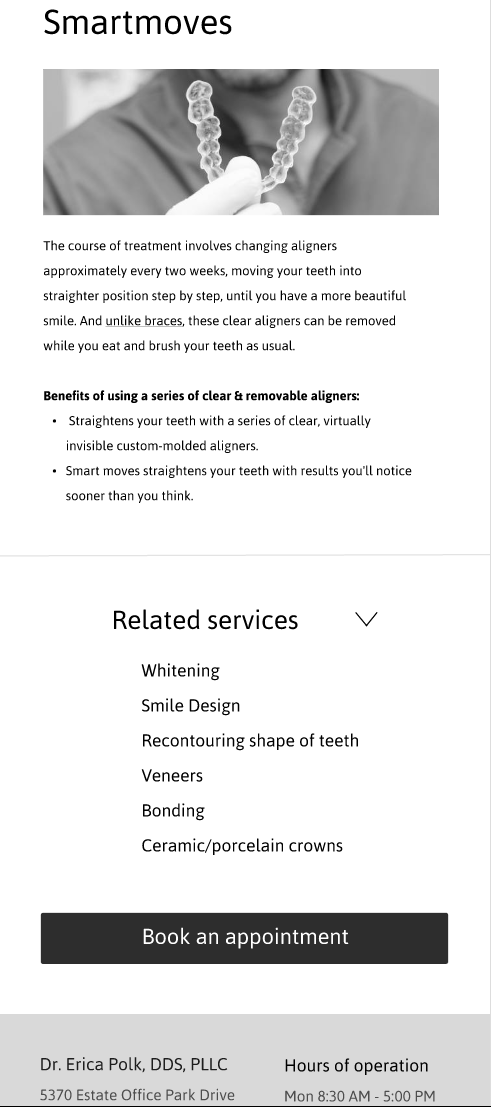
Content Clarity For Services
-
We made the text easy to read by adding a header for each topic. Summarizing in bulleted points. So it’s not a long paragraph.
-
Included FAQ for each services
-
Less redundant hours of operation and google map links
-
Visuals to support text

Simplified Navigation Structure
-
We reduced the number of tabs to minimize decision fatigue and confusion.
-
The new structure uses five clear categories that guide users through the site more logically, helping them find what they need without overwhelm.
Before

After

FINAL MOCKUP
Click Here To View The Final Mockup
Lessons & Reflections
This project pushed us to design within real-world constraints:
-
Minimal content provided
-
Inconsistent client availability
-
A user base with varying levels of digital comfort
We learned how to:
-
Communicate complex procedures through design
-
Build trust with every interaction
-
Adapt desktop and mobile flows for different user needs
-
Balance stakeholder wishes with user-centered solutions
Check out my other projects!

Website Maintenance
%201.png)
User Diagnosis MVP
